
AI Content Creation
Visual Style Lock: Creating Consistent Brand Aesthetics

Contents
- 1 What Is a Visual Style Lock?
- 2 Why Visual Style Lock Matters for Your Brand
- 3 Key Elements of a Visual Style Lock
- 4 How to Create a Visual Style Lock for Your Brand
- 5 Common Challenges and Solutions
- 6 Benefits of a Visual Style Lock in Digital Marketing
- 7 Case Studies: Brands Nailing the Visual Style Lock
- 8 Tools to Support Your Visual Style Lock
- 9 SEO Tips for Visual Style Lock Content
A visual style lock is the cornerstone of a cohesive brand identity, ensuring every design element aligns seamlessly to create a recognizable and memorable aesthetic. In today’s fast-paced digital world, where consumers are bombarded with content, maintaining a consistent visual presence is crucial for standing out. Whether you’re a small business owner, a marketer, or a creative professional, understanding how to implement a visual style lock can elevate your brand’s impact. This article explores the concept of visual style lock, its importance, and practical steps to achieve it, helping you captivate your audience and strengthen your brand’s identity.
What Is a Visual Style Lock?
A visual style lock refers to a set of design guidelines that ensure all visual elements of a brand—logos, color schemes, typography, imagery, and layouts—remain consistent across platforms. By establishing a visual style lock, brands create a unified look that fosters trust and recognition. For instance, think of global brands like Apple or Coca-Cola; their visuals are instantly recognizable because they adhere to strict design principles.
Why does this matter? Consistency breeds familiarity, and familiarity builds trust. When consumers see consistent visuals, they associate them with reliability and professionalism. A visual style lock acts like a blueprint, guiding designers and marketers to maintain uniformity, whether on social media, websites, or print materials.
Why Visual Style Lock Matters for Your Brand
Builds Brand Recognition
A strong visual style lock ensures your brand is instantly recognizable. When customers see your logo, colors, or fonts, they should immediately connect them to your business. For example, Nike’s iconic swoosh and bold typography are unmistakable, thanks to their consistent use across campaigns.
Enhances Professionalism
Inconsistent visuals can make a brand appear disorganized or untrustworthy. A visual style eliminates this risk by ensuring every touchpoint reflects a polished, professional image. This is especially vital for startups aiming to compete with established players.
Improves Customer Trust
Trust is hard-earned but easily lost. A cohesive visual lock signals reliability, showing customers you pay attention to detail. According to a 2023 study by Lucidpress, consistent branding can increase revenue by up to 23% because it fosters trust and loyalty.
Streamlines Marketing Efforts
With a visual style , your team spends less time debating design choices. Clear guidelines mean faster content creation and fewer revisions, saving time and resources. This efficiency is critical in fast-moving industries where agility is key.
Key Elements of a Visual Style Lock
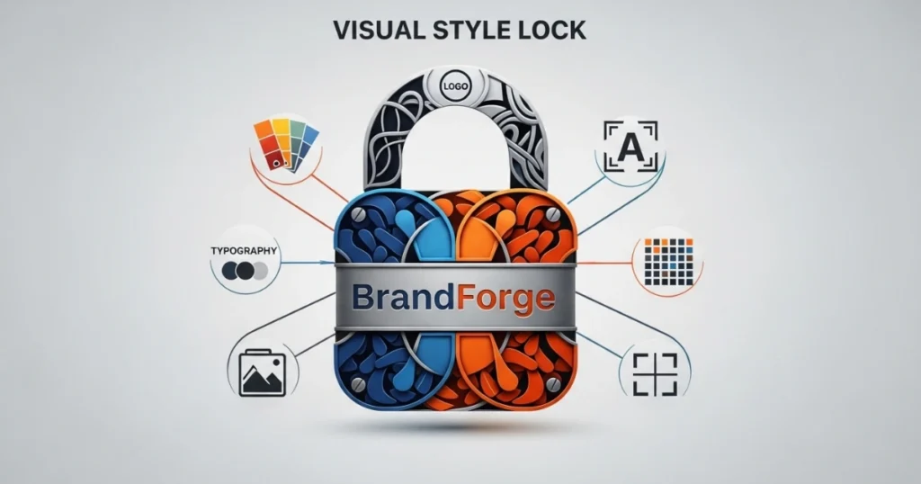
To create an effective style lock, focus on these core components:
1. Color Palette
Colors evoke emotions and convey brand personality. Choose a primary color palette of 2–4 colors, complemented by secondary shades. For instance, Spotify uses a distinct green and black scheme, instantly tying visuals to their brand. Use tools like Adobe Color or Coolors to develop a harmonious palette.
2. Typography
Typography sets the tone of your messaging. Select 1–2 fonts that reflect your brand’s voice—modern, playful, or professional. Ensure these fonts are used consistently across all materials. Google Fonts offers versatile, free options for web and print.
3. Logo Usage
Your logo is the face of your brand. Define rules for its size, placement, and variations (e.g., monochrome or full-color versions). Avoid stretching or altering the logo, as this dilutes brand identity.
4. Imagery Style
Images should align with your brand’s aesthetic. Decide whether you’ll use photography, illustrations, or both, and maintain a consistent style—such as minimalist, vibrant, or moody. Tools like Unsplash or Shutterstock can help source on-brand visuals.
5. Layout and Composition
Consistent layouts create a seamless user experience. Define grids, spacing, and alignment rules for websites, social media posts, and print materials. This ensures a clean, cohesive look across platforms.
How to Create a Visual Style Lock for Your Brand
Creating a visual style lock requires planning and commitment. Follow these steps to develop a robust framework:
Step 1: Define Your Brand’s Identity
Before diving into design, clarify your brand’s mission, values, and target audience. Is your brand playful or serious? Modern or traditional? These answers shape your visual choices. For example, a tech startup might opt for sleek, futuristic aesthetics, while a bakery might choose warm, inviting tones.
Step 2: Develop a Style Guide
A style guide is the backbone of your visual lock. It should include:
- Color codes (HEX, RGB, or CMYK values)
- Font families and sizes for headings, body text, and captions
- Logo variations and usage rules
- Image guidelines (e.g., filters, aspect ratios)
- Tone of voice for visual captions or taglines
Tools like Canva or Figma can help create and share your style guide with your team.
Step 3: Train Your Team
Ensure everyone involved in content creation understands the visual style . Conduct workshops or share the style guide to align designers, marketers, and social media managers. Consistency relies on team buy-in.
Step 4: Implement Across Platforms
Apply your visual style lock to all brand touchpoints—website, social media, email campaigns, packaging, and more. Use templates in tools like Adobe Express or Crello to streamline content creation while maintaining consistency.
Step 5: Monitor and Update
A visual style isn’t static. Periodically review your guidelines to ensure they align with evolving brand goals or market trends. However, avoid frequent overhauls, as this can confuse your audience.
Common Challenges and Solutions
Implementing a visual lock comes with hurdles. Here’s how to overcome them:

Challenge 1: Inconsistent Application
Solution: Use project management tools like Trello or Asana to track content creation and ensure adherence to the style guide. Regular audits can catch deviations early.
Challenge 2: Limited Resources
Solution: Small businesses can leverage free or affordable tools like Canva, which offers templates that align with your visual style . Outsource complex tasks to freelancers if needed.
Challenge 3: Scaling Across Teams
Solution: For larger organizations, cloud-based platforms like Google Drive or Dropbox ensure the style guide is accessible to all. Regular training sessions keep remote teams aligned.
Benefits of a Visual Style Lock in Digital Marketing
In digital marketing, a visual lock amplifies your efforts. Here’s how:

Social Media Cohesion
Platforms like Instagram and Pinterest thrive on visuals. A consistent visual style ensures your posts stand out while reinforcing brand identity. For example, Glossier’s soft pink aesthetic is instantly recognizable across their social media.
Website User Experience
A cohesive website design improves navigation and engagement. Consistent colors, fonts, and layouts reduce cognitive load, making it easier for visitors to explore your site.
Email Marketing Success
Emails with consistent visuals have higher open rates. A 2024 study by HubSpot found that branded emails with a visual style saw a 15% increase in click-through rates compared to inconsistent designs.
Case Studies: Brands Nailing the Visual Style Lock
1. Airbnb
Airbnb’s visual style lock revolves around clean typography, a warm color palette, and authentic photography. Their style guide ensures every listing, ad, and email feels cohesive, fostering trust among users.
2. Starbucks
Starbucks’ iconic green and white palette, paired with consistent logo placement, creates a unified brand experience. Their visual lock extends to packaging, in-store signage, and digital campaigns.
3. Mailchimp
Mailchimp uses playful illustrations and a bold yellow palette to stand out. Their visual style is evident in their website, emails, and ads, creating a fun yet professional vibe.
Tools to Support Your Visual Style Lock
To maximize your visual style lock, leverage these tools:
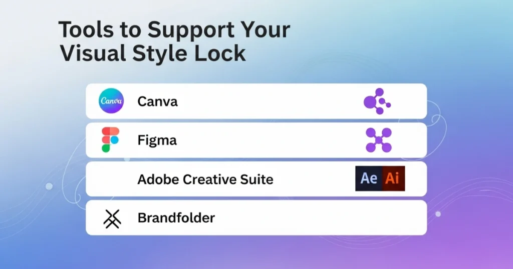
- Canva: Ideal for creating templates and graphics that adhere to your style guide.
- Figma: Perfect for collaborative design and prototyping.
- Adobe Creative Suite: Offers advanced tools for logos, imagery, and layouts.
- Brandfolder: A digital asset management tool to store and share your style guide.
SEO Tips for Visual Style Lock Content
To ensure your visual style lock content ranks well, follow these SEO best practices:

- Use Alt Text: Optimize images with descriptive alt text, including the keyword “visual style lock” where relevant.
- Internal Linking: Link to related blog posts or pages on your site to boost SEO and keep visitors engaged.
- Mobile Optimization: Ensure visuals are responsive for mobile users, as Google prioritizes mobile-friendly sites.
- Fast Load Times: Compress images to reduce load times, improving user experience and rankings.
Conclusion
A visual style lock is more than just aesthetics—it’s a strategic tool to build brand recognition, trust, and efficiency. By defining your color palette, typography, logo usage, and imagery style, you create a cohesive identity that resonates with your audience. Implementing a visual style lock takes effort, but the payoff is immense: stronger customer connections, streamlined marketing, and a professional image. Start by crafting a detailed style guide, training your team, and applying it consistently across all platforms. With a visual style lock, your brand will stand out in a crowded digital landscape, leaving a lasting impression.


Visual Style Lock: Creating Consistent Brand Aesthetics
Updated on September 5, 2025
Read More